From the Design Desk: Syracuse football’s gray uniforms
The Daily Orange Design Staff
Ranked No. 1 on USA Today’s list of “7 Worst College Football Uniforms,” Syracuse’s gray uniform made a guest appearance last week in the Orange’s game against Virginia Tech. While the gray uniforms were revealed to the public in 2014, this was the first time in a year that the players wore them on the field.
Sifting through SU’s combinations, here’s what The Daily Orange design team has to say about best game day outfit.
1. What was your first impression of the gray uniforms SU wore against VT last week?
Emma Comtois: The grey has no real tie to Syracuse University and its pride, so for that reason alone the grey uniforms don’t really work.
Lucy Naland: They may have been a little bland, but at least the Hokies seemed afraid of the gray.
Clare Ramirez: I’ve seen these uniforms before, so I didn’t really have a “first impression.” But wow, am I the only one who doesn’t completely hate them?
Kiran Ramsey: Who put the gray in Syracuse Orange?
2. What is the best color combination for SU’s uniforms and why?
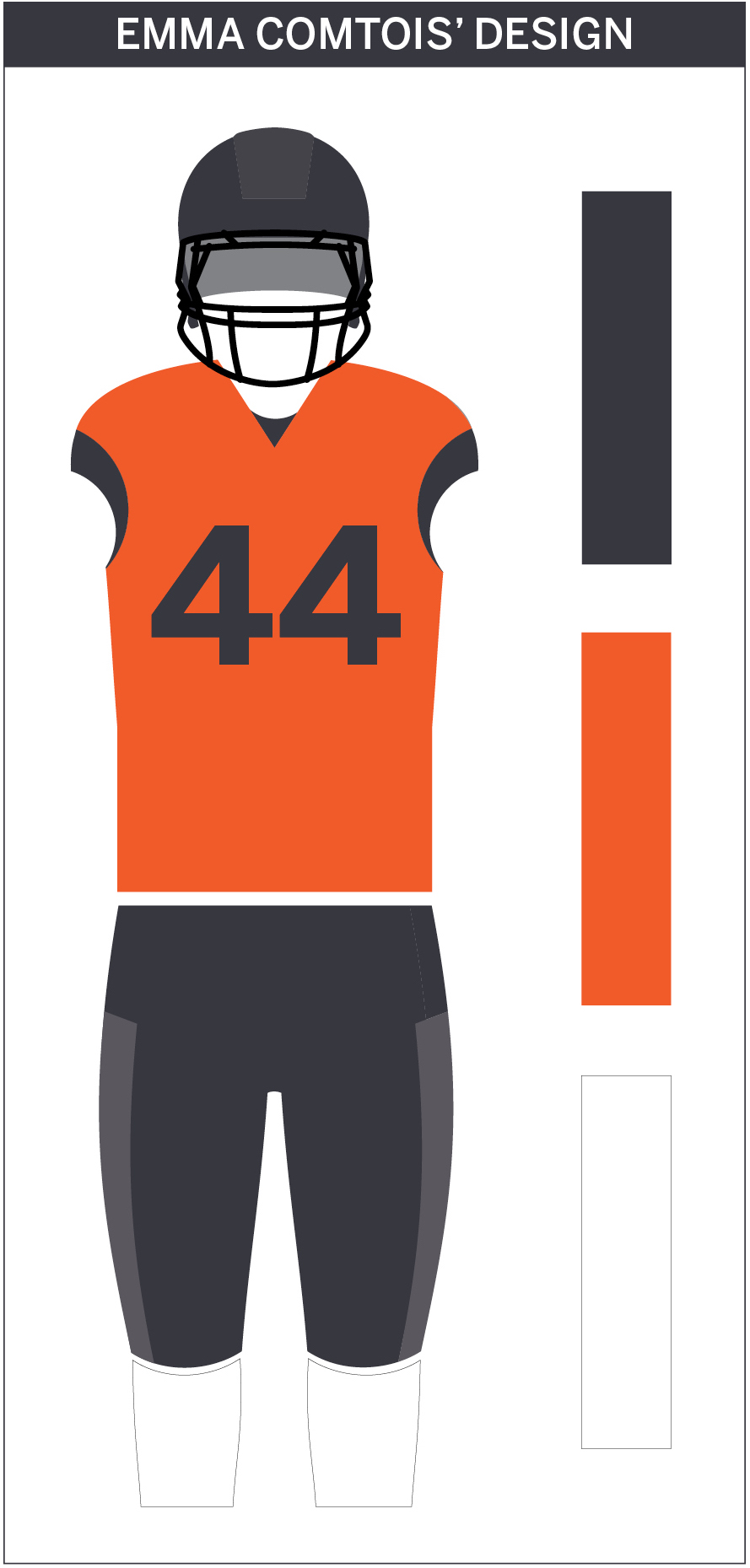
E.C.: I’m always a fan of mixing things up so I enjoy all the different color combinations SU wears to games. However my favorite is the navy helmet, orange jersey with navy numbers, navy pants and white socks. The orange helmets with orange jerseys clash because of the metallic color on the helmets but orange is always the best to represent SU spirit so including it in the jersey makes the most sense. Navy pants are the most practical for all the sliding and diving the players do during the game. The white socks break up all the color and tie it together.
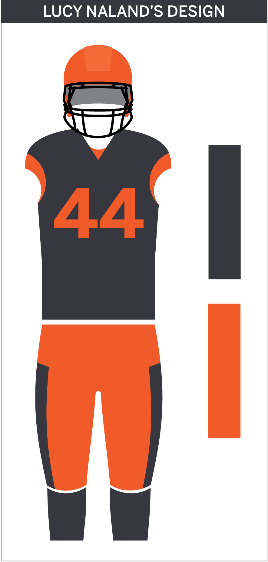
L.N.: There’s a lot of dislike for SU football uniforms out there, but I actually enjoy a lot of the combinations the team uses, especially the navy and orange uniforms. When trying to achieve harmony among colors, designers usually go for either analogous or complementary shades. Orange and blue are opposite each other on the color wheel, making them complementary to each other. This is why they work well together and it’s why I chose them for my ideal outfit. The jersey and pants are complementary colors, but both feature hints of each other. This creates as much balance between the blue and orange as possible.
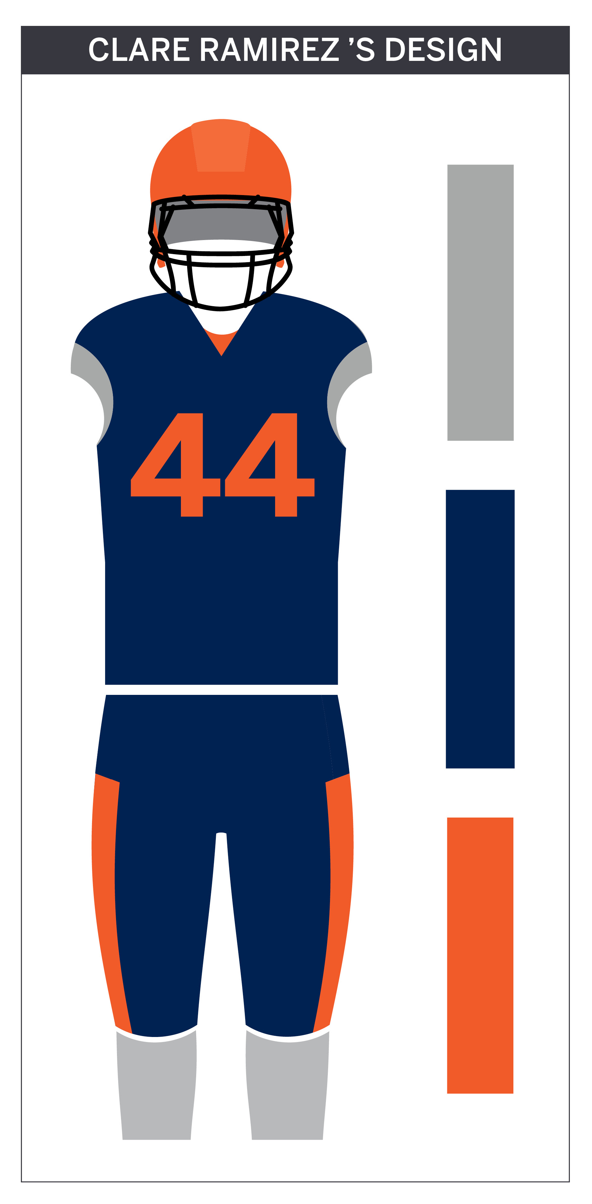
C.R.: I’ve got two approaches to this. Design wise, blue and orange obviously make for a good color combination since they’re complementary, but I think it’s cliché. The reason I like the gray uniform is because SU uses orange and blue as accent colors, rather than the base. I would suggest making the gray a little lighter, though. Probably more silver than gray.
On the other hand, this is football we’re talking about. Clichés don’t matter. When you’re watching a game, you don’t want to have to work to figure out which team is which. You want to see the school colors immediately and connect it to the Orange on the field. While I do like the gray uniform, my personal favorite would have to be the blue and orange. It stands out, it best represents the team and it makes it easy for fans to identify them. Aesthetics are great, but design is always about having the best representation, even when it comes to uniforms.
K.R.: SU Athletics has only two official colors in its style guide: “Syracuse Orange” and “Athletics Navy.” In 2014, gray popped up as a (third) secondary color. There’s an actual scientific reason that these uniforms have gotten some flak across the Internet.
Blue and orange are complimentary colors on the color wheel. Together, these colors have good color harmony, which, put simply, makes them nice to look at. Adding gray into the mix makes a less harmonious combination. The orange and blue don’t contrast well with the gray, which makes everything else on the jersey or helmet hard to read, especially on a TV screen.
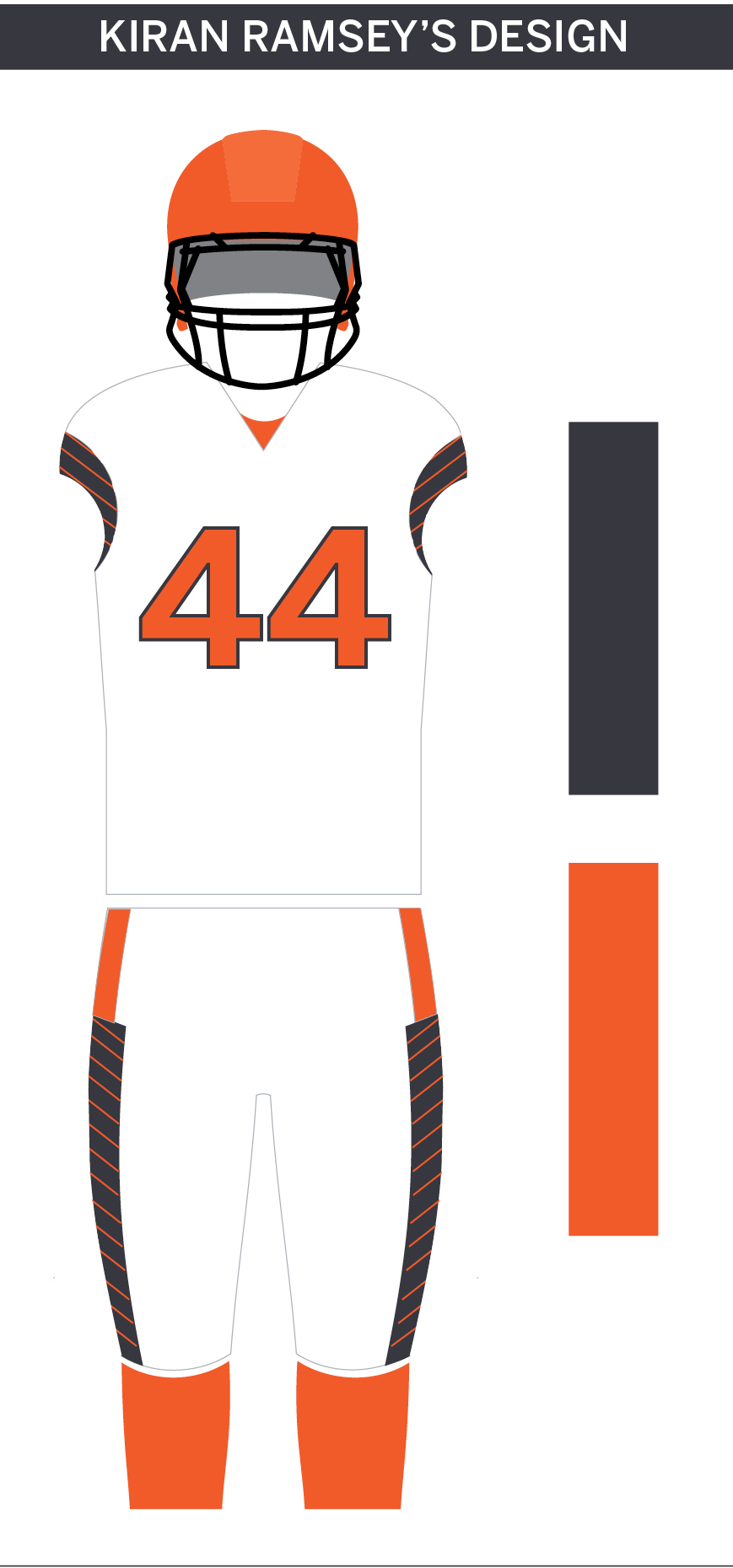
These two colors have come to define Syracuse Athletics. I think that sticking to orange and blue, no matter the combination, is the way the football team should proceed in the future. Personally, I’d like to see the players wear more all-white uniforms for their away games. I think the gradient-stripes that the uniforms have are unique, but these features can appear so much more crisp and clean with white as the dominant color.
3. Do you think SU should continue to wear a variety of colors and combinations, or stick to one or two styles?
E.C.: As mentioned above, I love changing things up so there is no reason in my mind why the players should limit their uniforms. All the combinations keep things interesting. While I have a preference for my favorite uniform none of the current color combinations really bother me.
L.N.: While it would be nice to see some more consistency, there’s no reason the team shouldn’t have fun with its uniforms. Flashy, new uniforms have become a huge part of college football culture and the NCAA has no limit on how many a team can wear. I don’t see why SU football players should be limited to just two or three, especially since the team usually sticks to the same color palette anyway.
C.R.: As of right now, SU has four options to choose from, and for the most part, I think that’s fine. I love variety. My issue is that, the gray uniform is not new, but not using it for a long period of time makes it seem like it is. It was introduced in 2014 as part of a “big announcement” at Destiny USA, but was really only used for the Notre Dame matchup at MetLife Stadium on Sept. 27, 2014. I could get behind using the gray uniform sparingly — maybe for big games or something — but keeping them hidden for more than a year is ridiculous. Twice a semester should be the minimum. Otherwise, what’s the point of even having a third option?
After all, they did beat Virginia Tech wearing the gray uniform. That should count for something, right?
K.R.: I’m a huge fan of the team wearing different uniform combinations. I do think that orange and blue should be the dominant colors, but if used correctly, gray as an accent color could be effective.
The gray used on the SU uniforms is much warmer than the gray in SU’s academic style guide, though. Changing it to a cooler gray could help make the uniforms pop. Overall, SU should keep in mind that variety just for the sake of variety is never a good thing.
Published on October 22, 2016 at 12:06 pm
Contact: design@dailyorange.com


