From the Design Desk: Starbucks Holiday Cups
Jessica Sheldon | Photo Editor
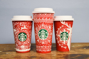
Starbucks brings back its holiday cups, which come in 13 different designs.
It’s official — Starbucks has officially brought back its red cups for the holiday season.
Last year, members of the public were upset because Starbucks ditched the designs and decided to go with plain red cups. But one year later, Starbucks has made it up to its customers by not only bringing back the designs, but by having several designs.
Here’s what The Daily Orange design team has to say about the coffee company’s wintery designs.
1. What’s your first impression of the 2016 holiday cups?
Emma Comtois: Did Starbucks pull these straight from the shelves of Anthropologie? I’m loving the bright white drawings layered over the classic holiday red for a really handmade feel.
Ali Harford: Sign me up for holiday season. Thirteen red cups is music to my ears, and they’re all so beautifully unique. I love thinking about the artists who drew these designs, since everyone imagines the holidays a little differently.
Andy Mendes: These cups are classy and cheerful, which is just what the doctor ordered after “Red Cup-Gate” last year. I think all 13 of the designs look different enough from each other to make you want to get them individually, but they feel connected enough to create a cohesive collection.
Jordana Rubin: Starbucks is stepping it up. Thirteen holiday cups, plus a election-time “unity” cup? Props to Starbucks for an extra festive end to a year that definitely needed it.
2. How do these designs compare to last year’s?
E.C.: Last year’s ombre cups were generally considered a fail because of their subtlety. On the other hand, Starbucks is making a strong comeback with these classic holiday designs that have a handmade, cozy vibe. The cups embody winter more so than just the holiday season, so these will appeal to almost all of Starbucks’ customers and spark a little holiday spirit.
Starbucks knew they had some major recovering to do from last year’s holiday cup fumble, so the company is covering all their bases with multiple designs. It was a really clever public relations idea to acknowledge the cups from last year were not the best. By reaching out to their incredibly vocal fan base, they were able to source creative art concepts that embody more than just one interpretation of winter. It makes the entire project really collaborative and much more successful than previous seasons. I appreciate this extra effort. The holiday season always feels long because it starts so early. It will be nice to change up what I drink out of throughout the winter months and try to catch ‘em all.
A.H.: I like how there are multiple designs for this year. After last year’s “war on Christmas,” it became pretty clear how popular these cups are, so I think Starbucks did a great job trying to incorporate universal winter elements.
Honestly, I think anything that incorporates art into everyday life is a win. Not only are these cups awesome on their own, but they’ll inspire even more cup art. I’m excited to see what else will come out of this.
As far as adding more elements, I think these cups are elegant and simple as is.
A.M.: Last year, Starbucks got heavily criticized for their holiday cups being too simple. Although I personally really liked the color, I obviously was in the minority. This year I get the best of both worlds, as last year’s color is returning, but with new white artwork overlaying it.
I love the idea of Starbucks reusing the previous year’s color and simply adding customers’ artwork over it. It’s their way of saying, “Hey, we know you didn’t like the design last year, what would you like your cups to look like?” It’s the perfect PR solution to last year’s fiasco.
J.R.: Last year I loved the minimalist red gradient cups — controversial, I know. Going into this year’s holiday season, I worried Starbucks’ efforts to prove they’re not waging a war on Christmas would result in a full-on Santa Claus logo. Releasing thirteen wintery cups which range from snowy trees, to white holiday lights, to abstract candy canes strikes a balance between not-so-seasonal and Christmas crazy town.
We are still in the midst of a surprisingly warm fall and the thought of snowbanks up to my knees and wind whipping through my bones fills me with dread. But the Starbucks cups’ lightweight brush strokes feel soothing and whimsical. They remind me of steam rising from a hot cup of coffee on a cold day. The icelandic sweater pattern in particular makes me want nothing more than to curl up with hot cup of tea under a warm blanket.
3. Which of this year’s designs is your favorite?
E.C.: My favorite design is the one with the reindeer and snowflakes. It feels so cozy and rustic. It reminds me of being in a cabin in the winter with animals roaming around outside, a fire burning and a cup of hot chocolate. That sounds ridiculous, considering I am talking about a Starbucks holiday cup — which is one of the furthest things from rustic. But the drawing is more like a sketch than a perfectly computerized image so it contributes to the warm tone of the cup.
I love the holidays and Starbucks cups are the perfect way to signal the beginning. When the cups are a disappointment, it starts the season off on the wrong foot.. This year, Starbucks did an incredible job of getting back to basics and appealing to a wide audience.
A.H.: My favorite design is the one with the pine trees covered in snow. When I think of the holidays, I think of cozy mountain cabins and gentle snowstorms that dust the trees. The pine tree design also makes me think of skiing, fireplaces, hot drinks — pretty much anything that has to do with the winter aesthetic. There’s seriously nothing better than wrapping your cold fingers around a hot mug.
All in all, the designs are really cute. Winter is my favorite season, and the Starbucks red cups are like icing on the cake each November. I think Starbucks really nailed it this year.
A.M.: While it’s hard to pick between 13 great options, my favorite has to be the cup with birch trees and snow falling around it. It really invokes a holiday scene: you’re sipping hot cocoa with your family while you all watch the snow fall in the woods outside. The artwork also uses a cool watercolor effect on the tree trunks, which really sets it apart from the other cups for me.
These cups are all really clean and simple designs that convey the message of the upcoming holiday season without beating me over the head with it. I love the sheer variety of 13 designs because it ensures everyone will enjoy at least one cup, if not all twelve of them. Starbucks is officially kicking off the holiday season, and here’s hoping everyone will be able to enjoy their hot beverages and not get worked up over a cup.
J.R.: The salted caramel mocha I picked up this morning came in a little red cup with painted ornaments. At first glance this cup felt extra Christmas-y to me, and to be honest I was bummed that Starbucks had caved in to the demands of the masses. But upon a closer look I saw the ornaments were way more bohemian than they first appear. Some of the ornaments are reminiscent of dreamcatchers with intricate designs in the center. The little feathers falling seamlessly with dainty snowflakes are unexpectedly harmonious without being too busy.
As a caffeine addict who spends her Christmases eating Chinese food or at the movie theatre, I cannot stress enough how much I enjoy the alternative take on classic Christmas imagery. Starbucks has proven this year how dedicated they are to the values of peace and unity. The ornament cup perfectly expresses these values by marrying Christmas spirit with desert tribe vibes in a delicate style which somehow embodies what holiday spirit is all about.
Published on November 11, 2016 at 12:08 pm
Contact: design@dailyorange.com